Web Design Trends for 2017
Being a designer, it’s mandatory that you should always be up to date of any new designs. In the past year many designers have tried to move away from any designs that are simple and have less composition. It’s also very important they watch the trend of others and follow them, to keep their skills improving and get outside of their comfort zone of design habits. So what defines Mesa web design in 2017?
Content
A good layout the brings out the content is a positive thing to have in web design. Within a given structure, the arrangement of design elements should give the reader an easy message to understand. Many designers have made the change to focus more on the content on pages. Focusing more on the content, us designers want to present it in a more efficient and pleasant way to the readers. Discovering that most people visit websites for the content, designers are hoping to see the content be a productive dialogue that never loses the heart of web design.
Bright & Dark Colors
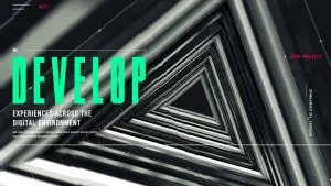 Many designers in 2016 wanted to add personality into their work. Adding bright and bold colors was the natural instinct solution. For example, the instagram icon: It was a plain jane panorama camera that turned into a brighter icon of a camera. It’s not only about just bright color but knowing how to work with it, as in blending/blurring the colors together. Many designers believe there is a more produced naturalism to the bold gradients and bright hues. Material Design says we should use these bright colors to highlight action and contrast with darker colors.
In 2016 web designers moved from the white to a variety of darker colors as well. It’s said that you’ll see more darker and bolder websites now with black and dark gradation backgrounds. Many are shifting to the dimmer tones in using gradations of gray, textures, or patterns. Many Brands are embracing a more conservative use of color to highlight their important elements, opting to keep away from overly harsh or clashing design themes.
Here is a great example of dark and bright colors contrasting: weareuprising.com, nine-dots.co, builtvisible.com, thewowcompany.com
 Animation
 Animation
In 2017 web designers are gaining more and more visual tools to help them build outstanding animations. We’re sure to see animations become more important and processed. Eventually animations will become easier to create and a very relevant part of web design. When creating an animation the designers should tone documentation to ensure that they will reinforce the tone content the creator is aiming for. It will help ensure the animations will perform a meaningful function for users.
 Animation is always there for allow you to do something different and original. Most animations are used for dividing sections of the page, as the page should scroll beautifully down a page. Content on the page should appear and disappear smoothly. Some animations can be interesting to enrich just a simple layout, adding special value on the page.
For an amazing example of animations, check out this page: nationalgeographic.com
 Backround
 Backround
Dashes, dots, and stripes have become more popular for a background pattern. It’s also very common to see the grid pattern, which is a frame for other elements of the layout. Often arranged in a disorderly manner, these elements are moved over the grid with a parallax principle. Grid patterns have a specific way of making all movement of elements reasonable. This creates a rhythm that will justify its violations.
Check out this awesome example of a settle but unique backround: freebies.lorenzobocchi.com
Typography
As content has become more focused in web designing, so has the typography. The old trend on text size of 10px is long gone as we moved more towards a larger text of 14px. Fonts have been more used for a decorative use in web designing. You can see the change in trends for typography through the fonts used. Recently, over the last two years web designers have been moving more towards different kinds of fonts such as serif fonts and non-serif fonts.
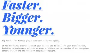 By popular demand, sans serif geometric fonts such as Futura, ITC Avant Garde, Proxima Nova, Poppins, and Montserrat have been seen more frequently. These fonts are more expressive, especially with a thicker weight. For headlines it is very common to see serif fonts with more decorative value. Most recently in 2016 it was highly common to move away from the soft fonts for a stronger contrast. Mixing the geometric font for headers and serif fonts for paragraphs to create an expressive combination. Also, many companies are moving towards a bolder typography for their homepages with the rest of the page kept simple and clean.
Here is an example of the new trend of typography: bigyouth.fr/en
 Overlapping
 Overlapping
Most recently it has started to become more popular to overlap images and text into web design. The text will slightly overlap the image. This design is used mostly for blogs and portfolio pages. You can also add to it with a colorful underline beneath the title to make the title stand out more.
This is a perfect and beautiful example: thibaultpailloux.com
Material Details
 There are may change for the minor details. Such as underscores and separators are shifting away. There is more elements that have detailed functions. Such as buttons are moving away from rectangles with text to more of a soft dash or some extravagant hover overs.
For 2017, modular design is staying. It’s a clean and accessible website that will keep visitors interested in sticking around on the website. A modular design is when you hover over the divided edges between modules with you mouse that will make an unexpected ripple effect. You can see an example here: waaark.com
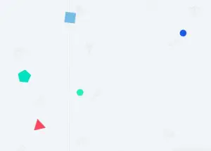
 Geometric and Symmetric Shapes
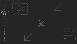 Geometric and Symmetric Shapes
Geometric shapes and patterns are becoming more and more popular on websites. Ruled out by flat design, it really adds some landscape and uniqueness. Symmetric content and shapes that are fleeing off of screen are becoming popular as well. Examples: msds-studio.ca, booneselections.com.
These are only a few of our most current popular trends. The internet is developing everyday, as so is web designing. We have developed so much in the past year for web designing that it is outstanding. Web designing is getting more and more creative as years pass by. If you’d like to read more about the web designing trends for 2017 click any of these links to learn more: awwwards.com, webflow.com, blog.hubspot.com. My Favorite Web Designs keeps up with the new trends and would love to help you with your website. Contact us today for more information about web design.
Written By:
Alexandra Roberson – My Favorite Web Designs
Mesa, AZ 85212
Phone: 480-335-1330
Email: Alexandra@myfavoritewebdesigns.com
Website: https://myfavoritewebdesigns.com


