Modern Web Design Best Practices According To Google
Google has put extensive research into the best ways to graphic design websites, so that they are easy for visitors to use, and easy for search engines to understand. By rewarding good website with search rankings, Google helps promote a better internet for us all to use through any devices.
Buttons and Links
Some of the latest ideas make a lot sense for websites to be used across devices. For instance, when links are displayed on mobile, they should be easy to click with a finger. This often means designing links to have extra margin and padding so they can be easily clicked without accidentally clicking something else. Another popular concept is the use of color. By having your calls to action and your most important buttons in bright and visible colors, you make your site easier to use. If the colors are too close to all the other colors on the site, this may make it hard to tell that it can be clicked or that it is an action item. Lastly, when an item is clicked or hovered over, it is good practice to have some motion or animation to this element. It makes it even more apparent it can be clicked, or that is has been clicked. Imagine if you clicked a button and nothing happened! So instead we make the button change color slightly, or remove a drop shadow to give the appearance of the button being pressed.
 Color Style
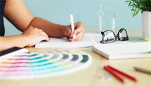
Another way to have users stay on your website is the style you have chosen. The color scheme can play a huge part on your website. Usually you should aim for a primary color and a secondary color that contrasts from the primary. When you have a primary color, you should limit to at least three hues and one accent color from the secondary. When it comes to the latest color schemes, the accent color should be used for little stuff such as links or buttons to catch the eye. To make text easiest for anyone to read, you should always have white on a dark background or black on a light background.
 Typography
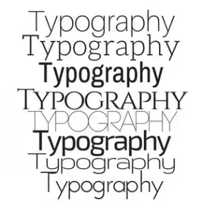
Recommended by google, a great way to keep your website settle would be the typography. Google’s goal for typography is to aim for something simple for comfort readable for any device.
Having too many different font sizes throughout a page can ruin a layout. Going along with the typographic scale can help with having readable font sizes. This scale has a limited set of font sizes that will work well together for any layout grid. Your heading should always have the biggest font and the subheadings should be a bit smaller. The button’s fonts should be slightly bigger from the normal text font and all in caps. When it comes to line height you should leave it as to what it is based to each style’s size and weight. Any other style should exist as single lines.
Menu Bar
Finally, the menu bar is an important aspect of your whole website. The menu bar has control over the website accessing other pages displaying a list of choices. If you have a long list to prevent all the choices from being displayed, getting a scroll bar is initially the best idea, especially for mobile devices. Each list word should only be a single line of text to keep it short and simple. In the app bar you should have the title of the page on the left and icons on the right side that relate to the app. The icons and text should remain the same color, and occasionally the title color may be different under some circumstances.
Landing Pages
Website Speed
When on a website, you are usually looking for something specific. What if only this website was really slow at loading pages? Wouldn’t that just make you give up and search for another website for the same thing? Having a website with so much on the pages can cause it to slow down. One example you should never do is have a large file size photo uploaded onto the page that is adjusted into a smaller form. You should always makes sure the picture file is smaller to fit to your webpage’s needs as it can speed up the loading process for your page and/or website. Having faster loaded pages will make your website more user friendly.
 Analytics
We use analytics to track our client’s user experience for their website. Analytics allows you to see what people have searched to find your page, what page is most popular, what the average time is on webpages, the locations of where people searched your web page, mobile vs desktop, and so much more.
These are only some of the main standing points that are more likely to be the most important for web design in Mesa. Google’s main focus is to keep things simple and easy for all devices that are readable for any user. To read more information about the best modern web design practices according to google, click here. If you have any more questions or concerns, call My Favorite Web Designs and speak with an experienced web designer. Our web designers will help and guide you to get you the website that you need. We are also listed among the top web designers by TopDevelopers.
Written By:
Alexandra Roberson – My Favorite Web Designs
Mesa, AZ 85212
Phone: 480-335-1330
Email: Alexandra@myfavoritewebdesigns.com
Website: https://myfavoritewebdesigns.com



 Color Style
 Typography
 Analytics


