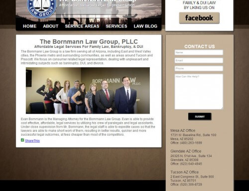
This website was actually one of my favorite web sites to design and build as we were able to use my photography and a beautiful color scheme with grunge touches. I was also able to integrate the contact form into the header. The layout is clean and crisp, drawing attention just where the attention should be.
We did a photoshoot for the lawyer at his office in Chandler Arizona. The office space was perfect for getting shots of the attorney in his working environment. Using these photos in the design can really make a difference between a cold indifferent template website and a warm friendly personalized local business website.
The website uses CSS 3, HTML, PHP, the wordpress platform, and a little bit of JavaScript. It is currently only styled for desktop computers, but displays well on tablets and mobile devices. It is also coded using modern conventions so that it can be set for specific styles on separate style sheets for separate devices, which makes it a great property to have for all of today’s devices and for all of the devices of tomorrow.


