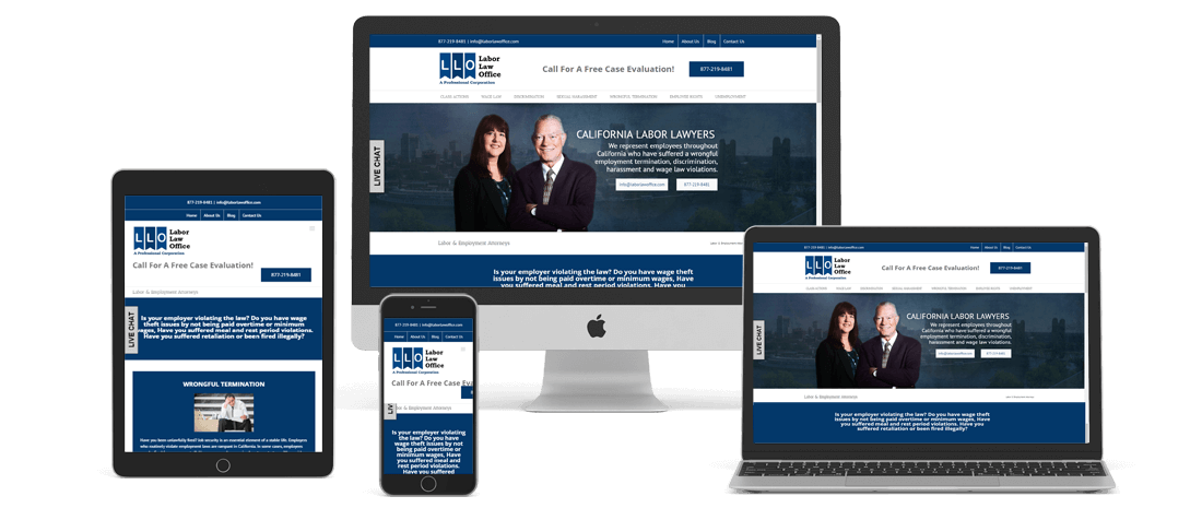
This law firm really needed a website update. They had a ton of junk content that was dragging down their site quality, all their most important pages hidden in a dropdown, and almost no trust builders. We worked with them to design a split level navigation, with corporate links small up top and the main service pages inserted large in the main menu and in a sticky menu. This client also had video we needed to showcase. Videos can be very useful to the user experience of any Phoenix website design, and we like to use video next to blocks of information. The thinking is that some people are visual learners, some audio, and some written word, so by having these two next to each other, it makes certain users can consume the info using the media of their choosing.


