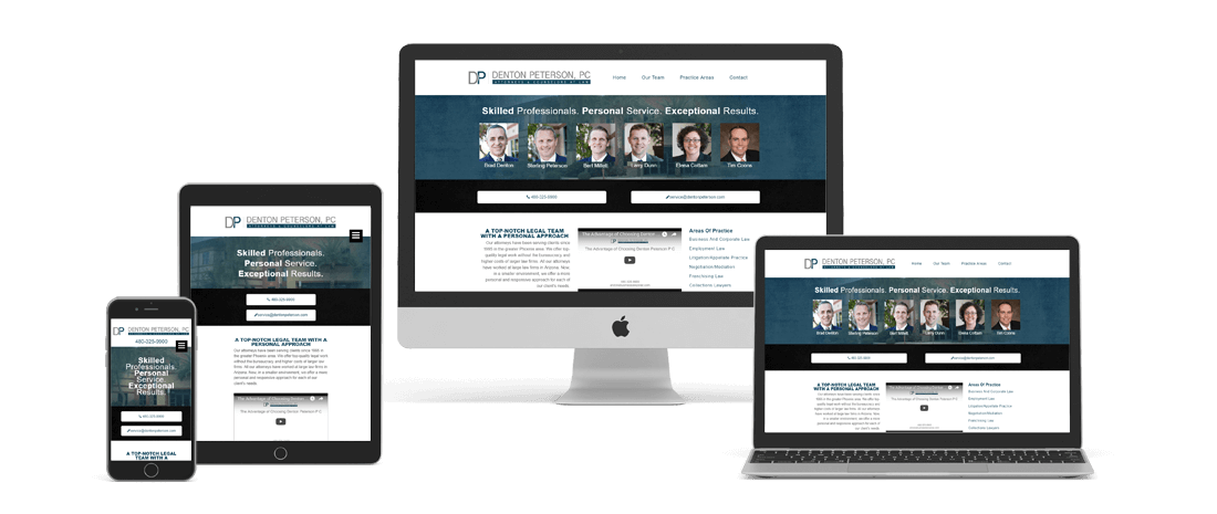
This site was built on a fully custom theme with a full width design. By using lots of padding and creating color variation for are different sections we are able to make the different areas of content clearly distinguished for our visitors which is a huge Plus in terms of usability for your website. Google has actually been pushing this type of design in their new material design guidelines. It also lends itself well to mobile friendly period material design with lots of padding means links that are clickable and not too close to other links on your mobile viewport. There are many design girls who think that we should be designing for mobile devices first and foremost and adapting from there to our desktop screen comma which I can totally see their Viewpoint given that the amount of traffic on mobile has gone well over 50% in the last two years. That being said I still like designing many sites with a desktop first approach, and this is a great example of one of them. In looking at their analytics and doing marketing with this client we determined that the average customer searching for a business lawyer is typically on a desktop device as opposed to a mobile device. While a mobile device can still convert the desktop users in this instance were more valuable.


