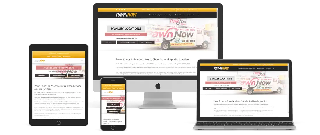
This website was done for a pawn shop with multiple locations throughout the valley. We needed a website that worked well on mobile and desktop and would help guide clients to their many stores. I knew that the site needed to help engender trust without making the client book overpriced. His clientele was typically a working class customer who depended upon Savvy shopping to make their budgets work. We categorized the products and made a mega menu so that we could show the many different types of merchandise easily in one glance. We also used a lot of icons in our navigation to help so visually what the link was. This was particularly useful as many of the website visitors would be bilingual.


